
TECHNICOLOR (2017)
conceived by LANDON WALLISER & CARSON WALLISER for Truth: A Pride Exhibition at The Fifth Parallel Gallery
featuring CARSON WALLISER & COLE MANZ-FRANCIS
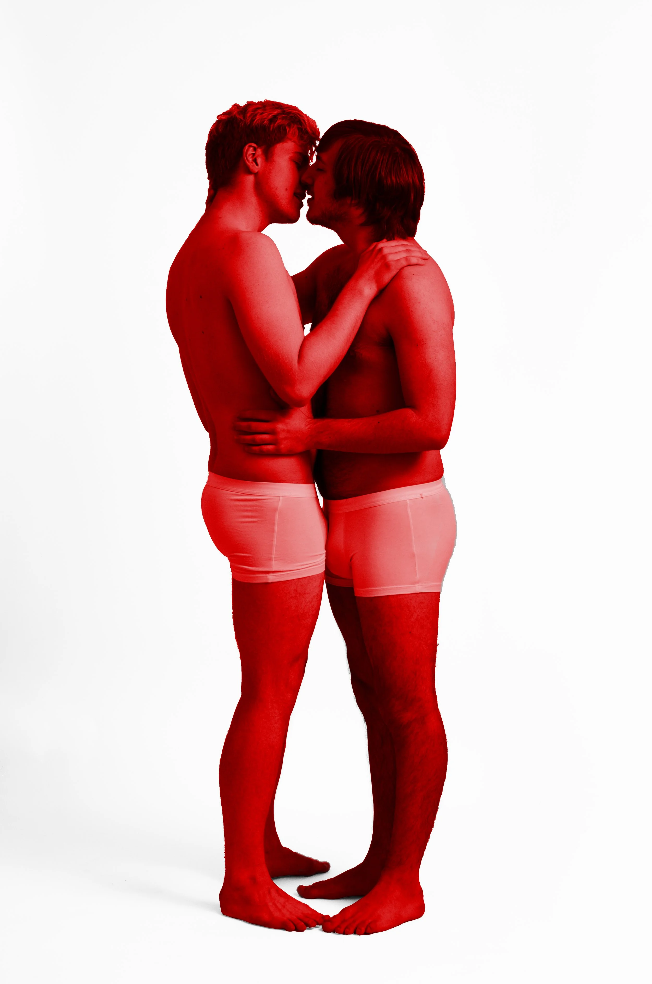
Life (Red)
Piece 1/6
Ink on Silk Chiffon
24 x 36 inches
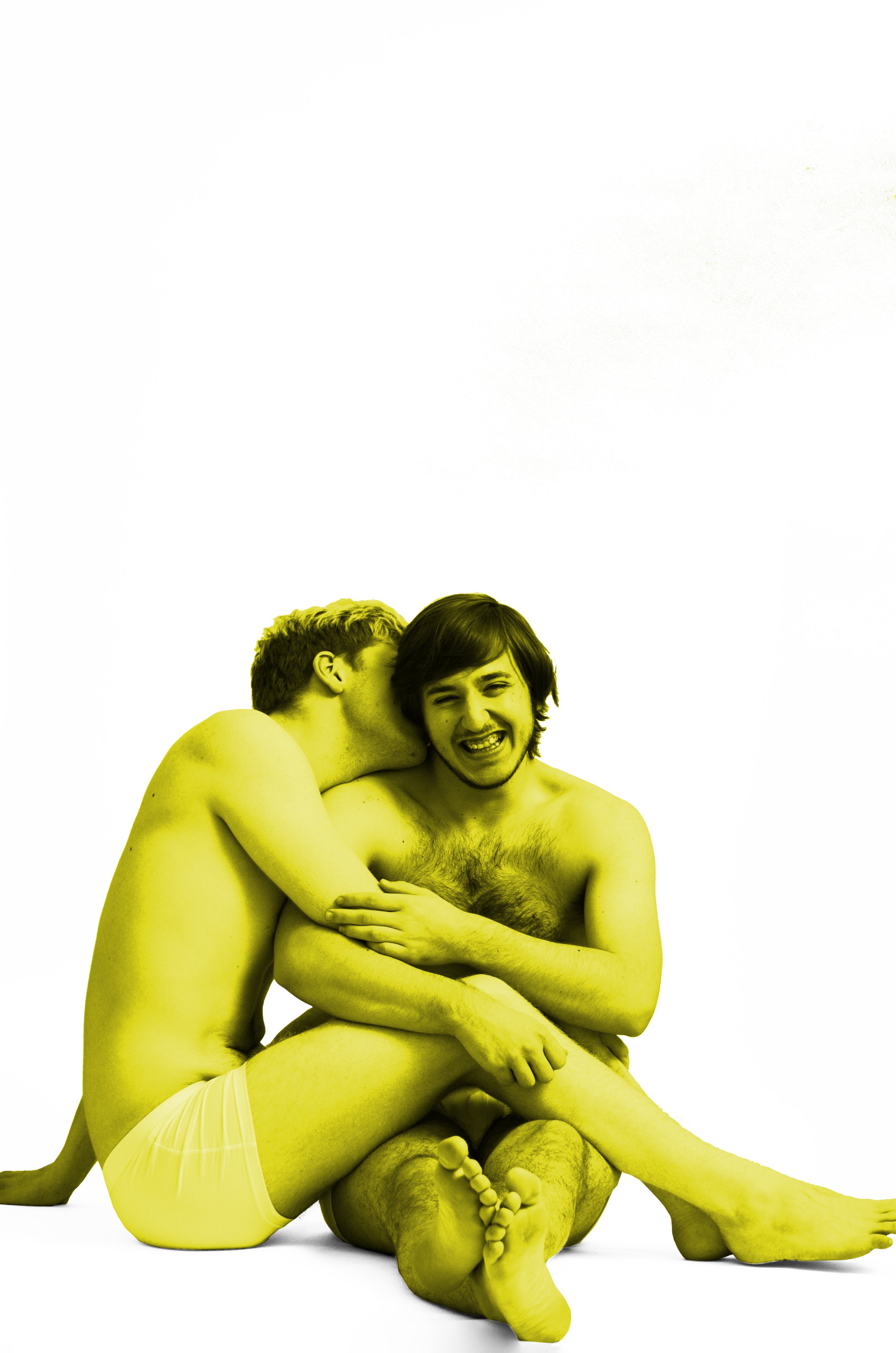
Light (Yellow)
Piece 3/6
Ink on Silk Chiffon
24 x 36 inches
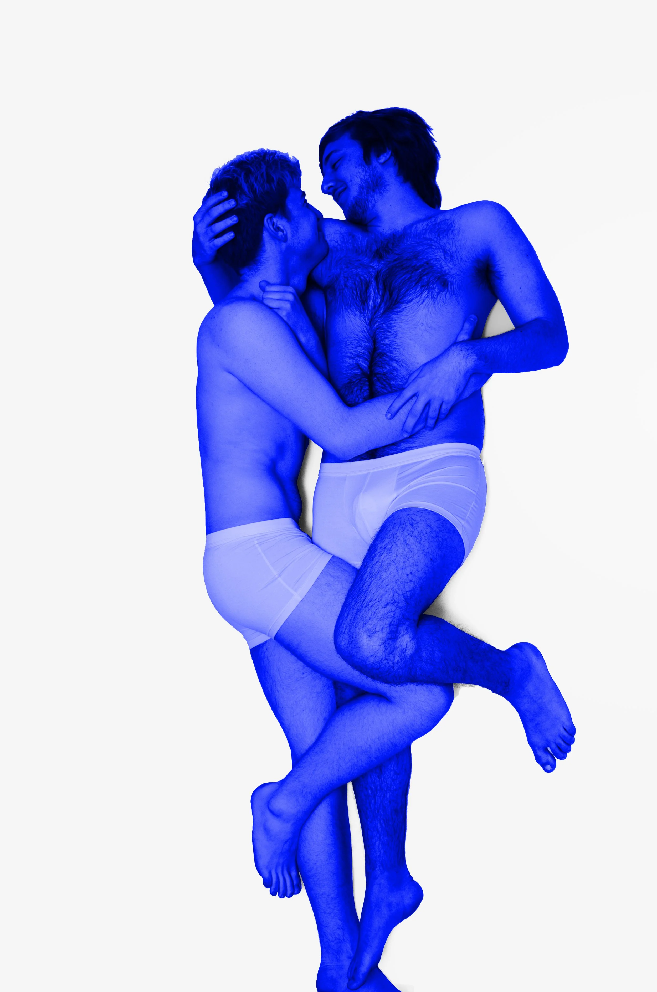
Harmony (Blue)
Piece 5/6
Ink on Silk Chiffon
24 x 36 inches
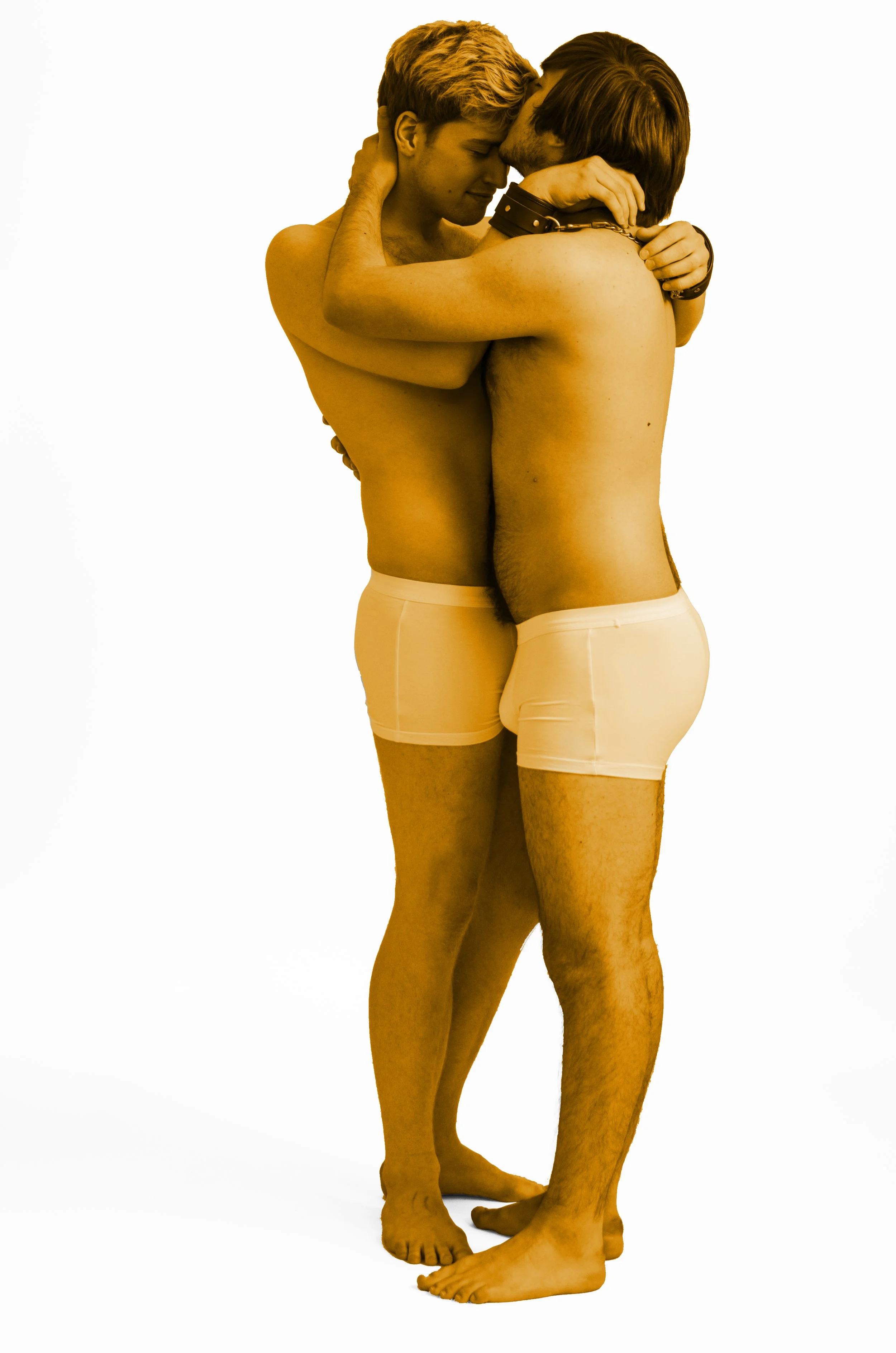
Healing (Orange)
Piece 2/6
Ink on Silk Chiffon
24 x 36 inches
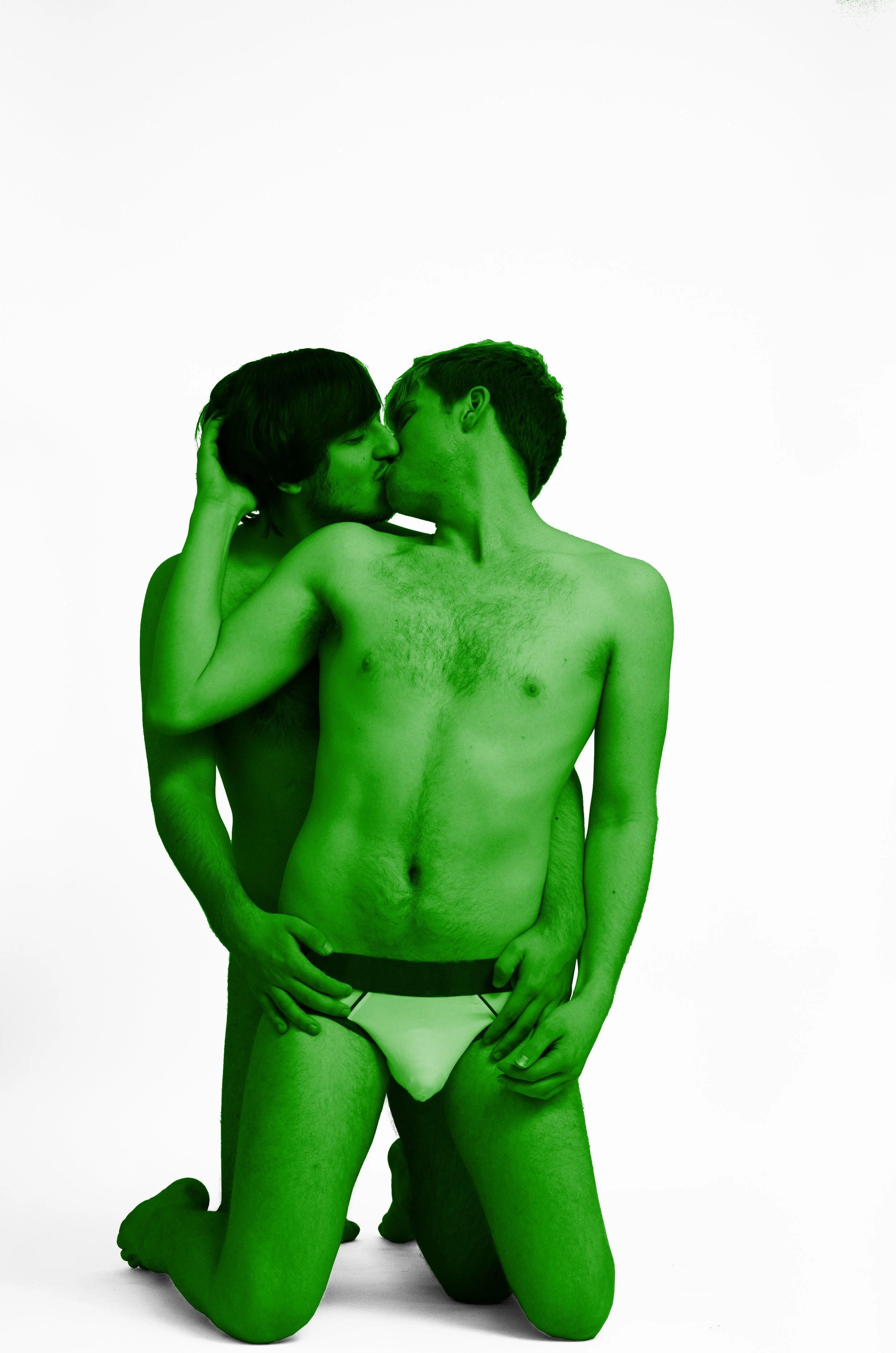
Nature (Green)
Piece 4/6
Ink on Silk Chiffon
24 x 36 inches
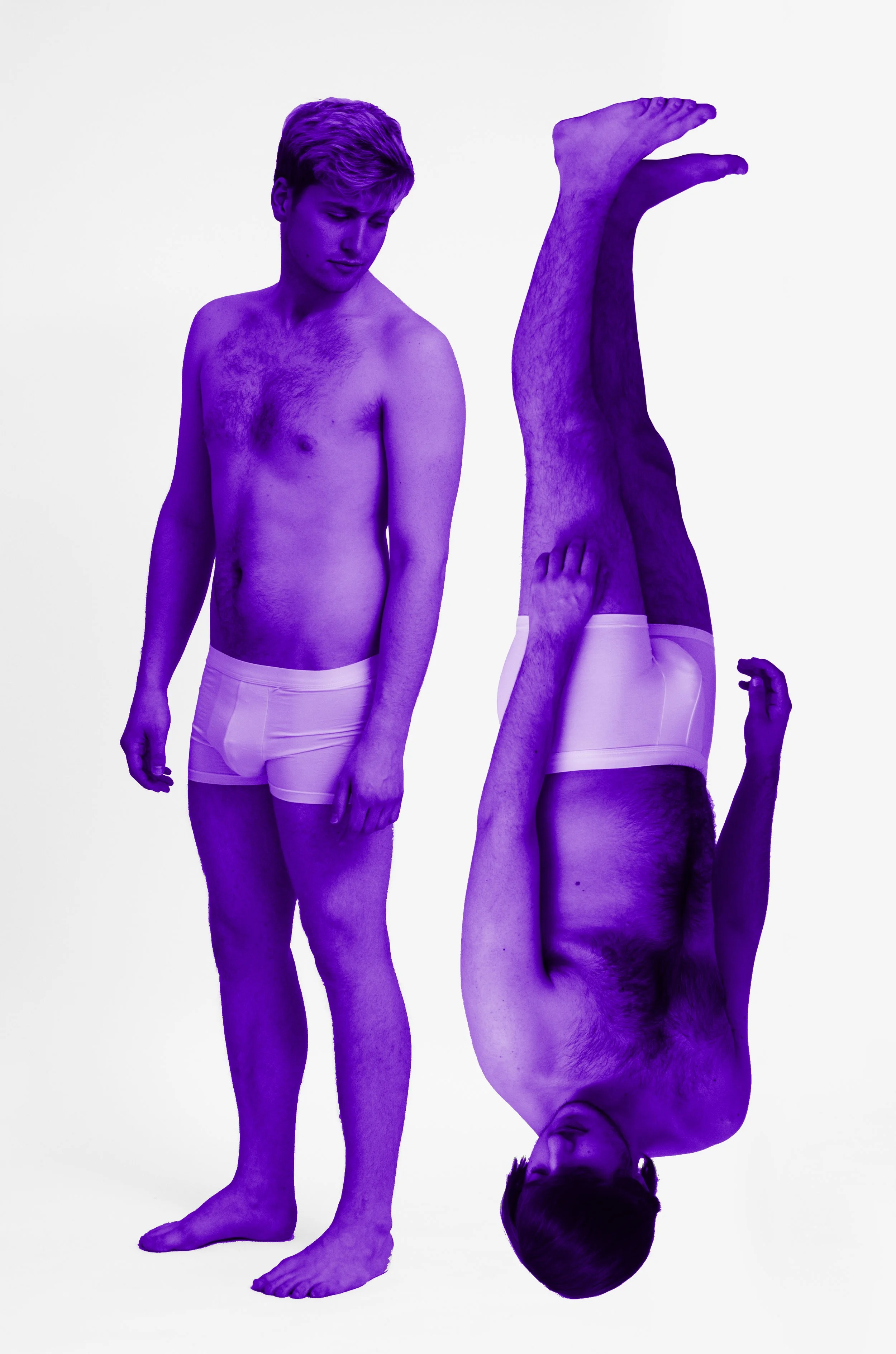
Spirit (Violet)
Piece 6/6
Ink on Silk Chiffon
24 x 36 inches
The pride flag was created by Gilbert Baker, a Kansas born army veteran who taught himself how to sew, who was challenged by Harvey Milk to create a symbol of gay pride. He is thought to have been inspired by Judy Garland’s iconic performance of “Somewhere Over the Rainbow” from The Wizard of Oz and how her death had factored into the Stonewall riots on June 28, 1969.
Technicolor is the process by which The Wizard of Oz was brought to vivid life. Dorothy’s dreary and sepia-toned life in Kansas captured the feelings of the Queer community before they were able to fully live in the open. To them, the technicolor world of Oz represented the diverse and accepting world that could be.
The eight colours of the original pride flag were chosen to specifically represent various aspects of ‘Queer life’: pink for sex, red for life, orange for healing, yellow for light, green for nature, turquoise for magic and art, indigo for serenity, and violet for spirit. Pink and turquoise were later removed from the flag; pink was removed due to unavailability of the fabric and turqoise was removed so that none of the colours would be obscured when hung vertically. The gay pride flag was first seen in public on June 25, 1978.
‘Technicolor’ is the about representing the truth of these concepts in contemporary Queer life. “Life (Red)” reflects the rich and exuberant nature of the moments that make us feel truly alive. “Healing (Orange)” reflects the small, intimate moments that pass between people as the piece each other back together. “Light (Yellow)” captures the joy that is shared by living openly and honestly. “Nature (Green)” is created as proof that queer relationships are no less natural in their mechanics than a heterosexual relationship. “Harmony (Blue)” reflects the unity found between people when all else is stripped away. “Spirit (Violet)” is about both reflecting our individual inner spirit as well as how we choose to worship.